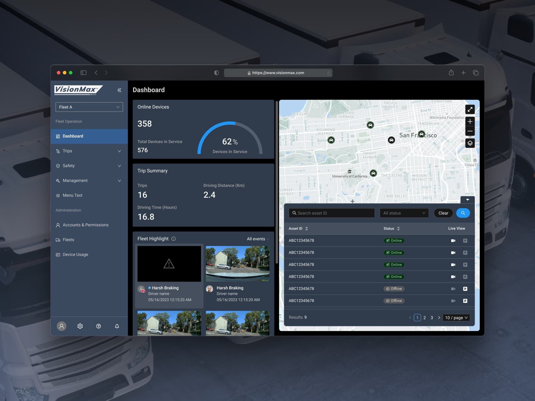
MioNext: Revolutionizing Connected Dash Cam Solution

Timeline
6 months
Company
MiTAC
Role
UX Strategy, UI Design, Prototyping
Links
Please note: This case study has been adapted for portfolio presentation in compliance with non-disclosure agreements. Sensitive details have been generalized while preserving core design insights.
Overview
The MioNext app and MiSentry dash-cam series deliver a cost-effective, IoT-powered solution that elevates every driver’s experience. Equipped with AI-driven ADAS and DMS, the system provides continuous monitoring and instant safety alerts, keeping owners effortlessly connected to their vehicles. If an incident occurs, it sends real-time notifications, uploads the relevant footage to the cloud, and enables remote viewing. More than a simple recorder, MioNext converts raw driving behavior into clear, actionable visual insights—going well beyond the basic driving focus of its competitors.
Problems
- The product lacks a unified design system, leading to inconsistent components and higher maintenance costs.
- The current UX and visuals are outdated, lowering user efficiency and retention.
- The product is undergoing rebrand and therefore needs to integrate new brand design elements.
Design Process
From Sketch to Figma
We moved to Figma for its real-time collaboration speed, developer-friendly handoff (Dev Mode, interactive prototypes), and more affordable, seat-based pricing; during migration we rebuilt the entire component library with Auto-layout variants, converted colors/typography into tokenized styles, set up shared design system files and branching rules, and onboarded the team via live workshops—completing the full transition in just 4 weeks.
Ground-Up GUI Specification
Starting from scratch, I built a comprehensive GUI Specification that standardized file structure, naming conventions, and a semantic version-numbering scheme; the living spec—documented in Figma with linked components and release notes—became the single source of truth for designers and engineers, cutting hand-off ambiguity and review cycles by 40%.
Building Design Systems
First, I rebuilt every core primitive—buttons, sheets, lists, search inputs—grounded in iOS UIKit and Android Material. Using Figma Auto-layout and variants, the library ships accessibility, motion, and edge-case states out of the box, giving designers and engineers a single source of truth.

Building on those primitives, I abstracted them into adaptive components that automatically apply native interaction patterns on iOS and Android. With one Figma spec driving both platforms, we eliminated duplicate tickets and cut front-end build time by 30 %.

To future-proof the system, I distilled colors, typography, spacing, and elevation into JSON-based design tokens synced directly to code, enabling rapid brand theming across regions and guaranteeing pixel-perfect consistency from Figma all the way to production.

The Solution
Guided by three core principles—Visual Consistency, Development-Friendly Implementation, and Scalable Information Architecture—we rolled out the solutions showcased below.


Final Design
After a 6 month sprint that unified the design system, refreshed every screen, and streamlined designer–engineer collaboration, the new MioNext app and MiSentry dash-cam lineup launched on schedule across iOS and Android with only minor issues quickly addressed in the first patch—earning the 2024 iF Design Award (User Experience) for its clear visual hierarchy, safety-first interactions, and brand-consistent UI.
Impact and Learning
-
Measured Engagement: OneSignal data shows monthly active users quickly surpassed 700, confirming that the streamlined onboarding and refreshed UI are driving adoption.
-
Industry Recognition: The redesign captured the 2024 iF Design Award – User Experience, validating our safety-first, token-driven approach.
-
What’s Next: With foldable devices gaining traction, we’ll extend our layout grid and component variants to deliver a seamless dual-pane experience on foldables.